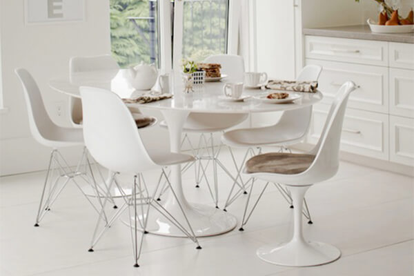
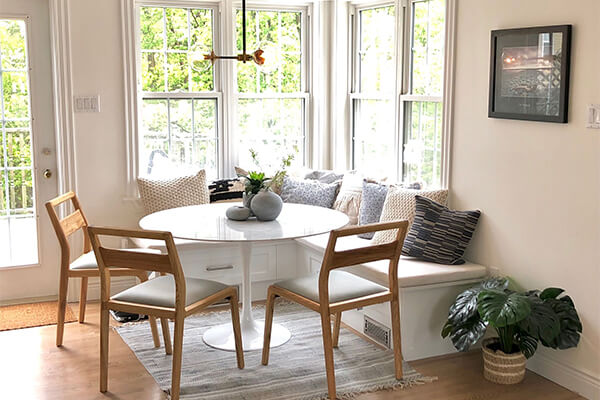
The tulip table was, is, and forever will be one of the most iconic furniture pieces ever conceived of. Designed by Eero Saarinen as a way to create smooth, fluidity within the dining set genre, it has definitely made its mark on the world. Outlasting decades of newly minted ideas and persisting with nothing more than a gorgeous formation, this table has been immortalized in an ageless medley by interior designers all around the world. If you’re wondering why so many professionals are so crazy about it, then here’s an extensive list of reasons for you. Let’s take a look:
-
An iconic midcentury modern masterpiece
Back when Eero Saarinen first came up with the design of this table, he made the first prototype for his own home. However, the design was so iconic that it rapidly became mainstream. To this day, the tulip table holds a high pedestal in contemporary design society. Both homeowners and professional interior designs absolutely love its sleek profiling, its homogenous form, and gorgeous finish. It’s a table that has carved its name in the history books and is bound to remain a classic.
-
Timeless design
One of the reasons that interior designers are totally in love with the tulip table is because of its timeless aesthetic. Saarinen’s vision was absolutely perennial – unfailing in a way that makes this table a beloved furniture piece even to this day. Its clean design and experimental form were avant-garde back in the day – still are too a certain degree – and still retain a definite uniqueness that never fails to make an impact on its surroundings.
-
Perfectly versatile
Another reason why interior designers are so crazy about the tulip table is because of its versatile aesthetic. Most contemporary tables can only be paired up with a select number of matching accessories and accompanying chairs. However, the design of the tulip table ensures that it is versatile enough to complement all sorts of chair. It always provides a very stark, visually pleasing contrast against whatever type of a chair it has been matched with, and this scores pretty high points with professionals.
-
Can be used in all sorts of interior designs
The visual versatility of the tulip table extends to entire interior design themes. It’s a piece of furniture that is as flexible as they come. Saarinen designed it to be as adaptable as possible so that it could retain its timelessness. This is why it can complement all sorts of interior design styles. For example, it could provide some modern contrast in a rustic ambiance and add a bit of clean modernism to an industrial style aesthetic. Of course, you can make it thematically relevant by pairing it with the right style of chairs.
-
Has a fluid form
The fluid form of the tulip table is another reason why interior designers love it so much. There’s a graceful, almost sculptural beauty to the form of this table that translates really well in spaces. It’s cleanly visualized in its subsequent materials. The circular interpretation of the top and base also work really well in providing an excellent visual symmetry. All of the sides of this table provide the same elevation, which is another reason that it is so versatile. From its artsy profile to the round top, everything is designed to fit spaces beautifully.
-
No visual clutter
Saarinen’s original concept of the tulip table was to eliminate all the visual clutter that comes with typical four-legged tables. He definitely managed to achieve this end and the sleek base of this table results in no visual clutter at all when you pair it up with different chairs. In fact, Saarinen’s tulip table base is so uncomplicated that it has managed to reduce the “slum of legs” from the formation to the best degree. No matter what kind of a chair that you slide in there, it’ll keep looking clean, and this aspect is especially attractive to interior designers around the world.
-
With color contrast
The tulip table comes in a very stark, understated white-hued color scheme. However, there are replicas that are black, grey, marble-themed, or wood-oriented. But the one thing that each one has in common is a color-monotony. This is what makes the tulip table so ideally suited for beautiful color contrasts. The white finish looks gorgeous against jewel-toned backdrops, bright colors, and dark tints. The darker colors look brilliant against the lighter backdrop themes. And then there are the textured tulip table finishes that look stunning with an eclectic mix of surroundings. All of this visual versatility is especially attractive for interior designers.
-
Flexible usability
The thing about the tulip table is that it has a very classic form. This not only works on enhancing its visual versatility, but also allows it to be featured in a number of different settings such as commercial, retail, and of course residential. Tulip tables are often used extensively in restaurants, food courts, and even offices. This pragmatism and functional versatility also makes them a total designer-favorite.
-
Perfect accenting
Another one of the reasons why the tulip table is such a big hit with interior designers is because of its great accenting potential. It has the type of artsy, sculptural forms that can provide some great shapely contrast within any interior design. Its potential for being an eclectic addition in most homes is highly likely. And the fact that its form is extremely fluid and can easily beautify all the accessories that it’s paired with is just another tick in the pro corner.
-
Complementing all spatial dimensions
All of the contours, curves, and edges of the tulip table have been designed in a way that suits every type of a space – be it large, medium, or small. What’s better is that the top is available in various diameters so that you can choose the size the perfectly suits your spaces if the generic one doesn’t fit. This is another form of flexibility that works in its favor, and definitely another one of the reasons why interior designers are so crazy about it.


